Showing posts with label museum. Show all posts

March 18, 2016

1920's goodness

There will be a proper blog post here soon, but for now, a little intermezzo will have to do.
I've been on a short break and came home with a cold. So, I haven't had a lot of time for sewing. However, all the fabric for my 1920's dress has been cut so I should be able to start on it quickly.

In the mean time, I've had some more inspiration for 1920's dresses and more confirmation for my colour choice:

This lovely display of garments from the 1920's is on show at the V&A in London right now (it is just part of a small display of their own collection. A new large fashion exhibit, all about underwear, will open in April).

September 27, 2015

Vintage glamour

When do you think fashion was at its most glamorous? In the 1950's? Or the 1930's? Whichever era you choose, is that choice based on the clothes themselves, or on the way we've seen them in pictures? 
We don't often get the chance to inspect real couture gowns from any era but we can all look at gorgeous pictures of them. As a result, the style of those photographs becomes part of what we see as the look of a particular era. Their style is in part a result of the same spirit of the time which inspired the fashion itself. On the other hand, it is also often based on the technical possibilities at the time and on the individual skill and style of a photographer. Because of that, some fashion photographers have become stars in their own right. Fans of vintage fashion may be familiar with some names of these old masters of photography: Cecil Beaton, George Hoyningen-Huene, Horst P. Horst...   

Yesterday, the exhibition "Horst P. Horst, Photographer of Style" opened in the Nederlands Fotomuseum (= Dutch Photo museum. The link goes to the Dutch version of the site because the English version doesn't load properly) in Rotterdam. 
As a photographer for both French and American Vogue from the 1930's to the 1950's, Horst was certainly one of the people who defined the vintage glamour we know and love today. Even if you don't recognize the name, you will probably have seen this image, a 1939 advertisement for Mainbocher corsets which is the most famous example of his work today:

The exhibition shows a great overview of his work, including a huge amount of iconic fashion images and portraits of fashion designers, actors and artists. Much of it is shown in the form of original vintage prints, often not much bigger than the negative format used for the images for 1930's Vogue: 8 by 10 inches. 

Interestingly, this makes viewing these sleek, monumental images a rather intimate experience. Many of these pictures were probably printed to show the images to editors or clients and there are a few examples in the exhibition which bear pen marks which show the retoucher how to alter the image. A great look at "Photoshop" before the digital age. 

As an added treat, there were also some examples of Paris couture gowns from the 1930's. Glorious designs by the likes of Vionnet, Schiaparelli, Gres and Chanel, on loan from the Victoria & Albert Museum in London. 


Oh, and the colour images were a real surprise as well. The colour negatives you may remember didn't exist yet in the first half of the 20th century but there was another process available at the time. Technically complex and expensive, it was only used for commercial photography and magazine covers. 
Horst took many such pictures and those were there too. The original magazines were in display cases but there new, large prints have been made from the original film of quite a number of them. Unlike 1970's colour negatives, the colour information on the film from this rare process doesn't degrade over time so the new images look incredibly fresh, beautiful and difficult to date. 

And that wasn't even all. 
With the Horst exhibition as its main display, the museum has decided to make a bit of a theme of "fashion". To this end, they asked fashion designer Mattijs van Bergen (I didn't know the name either but as a graduate of ArteZ in Antwerp and with a master's degree with Central st. Martin in London, he might be one to watch) to create a collection inspired by the museum's extensive archive of black-and-white photographs (which includes the work of many celebrated Dutch photographers). In turn, this collection was photographed by three different fashion photographers. 


Before seeing it, I was a bit skeptical about this project, I feared it might be a bit of a gimmick. However, the result was actually very nice. Unfortunately, the presentation (which works quite well for a visitor of the museum), on dark dummies in spotlights in a dark corridor, made it very difficult to get some pictures to share with you. 

You can visit both exhibitions until January 2016.  

September 22, 2015

Dutch fashion

Just a little tip if you happen to find yourself near The Hague in the months to come (between now and February 2016): The Gemeentemuseum is hosting its annual fashion exhibition! This one is called "Ode to Dutch Fashion". 

As a volunteer for Modemuze (="Fashion Muze", a website which promotes the Dutch museums which have fashion collections and makes those collections available online), I got to go to the opening of the exhibition yesterday evening. Which was fun but I will definitely go back for a better look. And because the museum allows visitors to take pictures as long as they don't use a flash nor a tripod, I will try and share that look.

For now: Don't you love the use of the stripes in this dress?

July 9, 2015

18th century printed cotton and more...

I didn't plan to take a break from blogging but because of it, I can now proceed straight away with telling you about that museum tour. 

In fact, it wasn't at the museum at all. It was at the museum depot. The Rotterdam Museum doesn't have room in basement or attic to store items which are not on display, like many museums do. It shares a depot at the edge city with other museums from Rotterdam. It's not a place visitors usually get to see, which actually makes it more fun to have an opportunity like this.


The museum's collection slumbers, carefully packed, on endless shelves in large rooms which are kept at a temperature of 17 degrees Celsius at all time.

We came to look at items made from chintz and the sample books from the Rotterdam Cotton Company. 


The first item was this magnificent, but impossible to photograph, 18th century dress. We were looking at it with the dress lying flat on a table, great for studying all the details, not so great for pictures. 
It is made from genuine chintz, imported from India, hand-painted in a glorious, large, intricate floral design on this deep red ground. There is a repeat in the pattern but only in about a meter and even then, it isn't exact. Because it is hand work, obviously.
The dress is in a great shape, the fabric even still has its shine.

This skirt is also made from hand-painted chintz but this design seems more European in style. And the design was specifically made to be made into a skirt like this. 

On this lovely children's dress, the design is large but ordered almost like a jacquard (which is, of course, a woven fabric from Europe, usually France).

And this woman's jacket has a very small print. Still hand-painted in the same technique, but very different in look. 

Chintz became very popular in European fashion from the late 17th century onwards so it was perhaps unsurprising that factories across the continent tried to produce something similar. 
That is where the Rotterdam Cotton Company came in. Under various names, this company has existed from the early 18th century up to 1930. They did produce immitation chintz but unfortunately, those sample books are not in the collection of the Rotterdam Museum (some are at a textile museum in Twente). There were some pictures from it. Not just chintz-like floral but also abstract prints which wouldn't have looked out of place in the 1930's or even in the 1950's.

The sample books in this collection date from 1870 to 1930 and show a variety of designs. Some were for local use but many were made for export. Those are particularly interesting: Many designs mimic Indonesian batik fabrics and were made to be sold there to consumers who couldn't afford the real thing. Indonesia was a Dutch colony at the time, which made careful research and marketing possible. 
The same fabrics were occasionally also sold elsewhere, particularly in Africa. Over time, new designs were developed to appeal specifically to that market (other printing companies did the same and one which really specialized on Africa still remains today, Vlisco). 

The Rotterdam Cotton Company created its designs by block printing. Blocks were cut from wood and the fine line details were made by adding small pieces of copper. Separate blocks had to be made for each colour in the design and all blocks had to be perfectly lined up. Block printing may have been less labour intensive than hand painting or batik, it was certainly not a simple process. 

Then, there was a bit of time left to look at some more garments. 


The length of this jacket betrays its age: It has to be from the early 19th century. What looks like yet another floral print isn't a print at all though... It's embroidery, very very fine chainstitch embroidery.


This longer jacket (which was under the short one in the earlier pictures) is made from printed cotton. This one is interesting because its insides show how the bodice length has been changed in such a way that it could be changed back.


The final piece was this short cape, made from chintz with a very dark brown background. It is lined in wool of the same colour decorated with tufts of beige wool. The design looks like an imitation of ermine but in a different colour. 
The full circle cape was pieced to use the least amount of the expensive outer fabric. This was hand-painted chintz as well so it must have been expensive. Even today, the fabric has so much shine that it almost looks coated in plastic...

I hope you've enjoyed this little look in the depot. I certainly did. I suppose this is why you should pay attention to vaguely announced events held by you local museums ;)

March 5, 2015

Is this the real thing?

This caught my eye a while ago. In fact, I have no idea why I haven't blogged about it before. 
This is the thing: Getting a general idea about how fashion changes over the decades is fairly simple. But if you get beyond that, read period sources and get an idea about the smaller trends and hypes that lasted maybe only one season, you get a different picture. And that's where interesting things happen. Many of my favorite looks from the late 1940's and 1950's fit into that category: Interesting designs that won't show up in a general view of those decades. I've shown examples of that in blog posts for a while and it was an important reason to start using Pinterest. But how great would it be to see some of those designs in real life?

I haven't had that chance yet but I think this is half-way there: The Gemeentemuseum here in The Hague is working on creating an online database of its collections (of fine art and crafts) and one of the things that is on there already is the haute couture wardrobe of opera singer Else Rijkens (1898-1953)(I'm sorry but the information is only in Dutch for now).  All the pieces on the site seem to be from the late 40's and early 50's. This may mean the museum still has to document the rest (I guess they are still working on it, that would be the only reasonable explanation for the variation in quality of the pictures) or maybe this was the time when the lady's career was in full bloom and she could afford haute couture. 
However... This means that what's already there covers my favorite years in fashion history!

And when I was browsing this database a few weeks ago, I noticed this dress:

Although it looks lilac in the picture, it is described as grey. And just look at that amazing skirt: Ray-of-the-sun style plissé from a zig-zag yoke... Wow.

It made me think of something I had pinned a while before that:

This dress from Beatrijs magazine. 
It appeared as an illustration for an article about practical fashion (basically about fashionable alternatives to the on-trend narrow skirts). The whole article talks about Dutch reality (rain, cycling) versus Parisian style (those narrow skirts, high heels, taking a taxi when the weather is less than nice) and yet they've chosen to publish it with pictures of glorious couture dresses...

There are clear similarities between the dresses in these pictures. First of all that amazing skirt, and both were created by the same designer: Jacques Griffe. They also have the same colour: Grey. 
After that, things get a bit sketchy. Else Rijkens's dress is made from silk taffeta, the one in Beatrijs from thin wool. The collars are different. It's not just a matter of buttoning up or down. You can see a simple notched collar in Beatrijs's picture which is obviously not there on Else's dress. And the dress in the magazine doesn't have a self-fabric belt. 
The front dart may be in different places but that's hard to tell from these pictures. The sleeves may the same.
The most curious bit of information is, again, in the written text: The woolen one appeared in the Beatrijs magazine of 20 April 1951, the dress in the museum is listed as being from 1952/1953...
The only explanation I can come up with is that the magazine may have used very recent pictures. Pictures which were taken at the same time that designs became available to order by couture customers. That might explain some delay, but not likely more than a year. Is it possible that designers in the early 1950's allowed their customers to order their favorite designs from previous seasons? Or could the museum simply be wrong about the date? 


November 6, 2014

My fashion history fix

There's another fashion exhibition at the Gemeentemuseum here in The Hague!
This time, it's about 19th century fashion. The title is "Romantic fashions", subtitled "Mr. Darcy meets Eline Vere" (Eline Vere is the title character of a novel by Dutch author Louis Couperus).
(I found this title a bit confusing because, in the environment of a museum, I tend to interpret 'romantic' in an art-historical kind of way. Which is not correct in this case. The exhibition is about normal 19th century fashion, which, to us today, looks 'romantic' in the usual 'street' sense of the word)

The exhibition looks at fashions from 1800 to 1914 and the huge amount of development during that time. The focus is on womenswear but there are some outfits for men and for children there as well. 

There are a lot of historical dresses but also some costumes from movies and tv series (Pride and Prejudice, Downton Abbey). And there is a room with clothes by modern designers, inspired by the 19th century (personally, I can take or leave that one. I would have preferred something else, like more corsets).

There are certain things which this museum does really well. 
I loved the way they set the scene in each room with the backdrops. Huge stretches of way decorated with enlarged period images which match the dresses on display both in occasion and in colour. 
And the slowly turning platforms on which the ball gown were displayed. And the clever use they made from the small side rooms to show off small numbers of dresses with a separate theme.

I'm less keen on the persistent habit to put the information about the actual dresses on one little plaque way to the side of each display. It's almost fortunate that this information is mostly very limited (often just year and material) because this way of displaying it forces you to keep walking up and down between the information and the dress you're looking at.
Fashion history purists may also be a bit shocked about the hair treatment: To make the whole display look more modern and approachable for a 21h century audience, they have chosen not to use period hairstyles but the let present-day hairdressers create wigs which are both inspired by the dresses and the period and yet are kind of 'now'. I thought it looked good though...

This exhibition will be there until the end of March 2015, so there's still plenty of time to see it. If you even remotely like fashion history, I heartily recommend it.
Of course, many of you don't live anywhere near The Hague, The Netherlands. You can read about it on the museum's website and I've made a Pinterest board with all the pictures from my visit.

February 26, 2014

Eye candy?

Did last night's episode of The Great British Sewing Bee spook you?
For those of you who haven't seen it yet: I hope it's not to much of a spoiler if I tell you the 'theme' was print matching.
As any sewer knows, matching prints can be quite a challenge and, predictably, some contestants really struggled. For those and for anyone who feels intimidated by matching prints, I'd like to present this picture as a bit of encouragement:


I saw this dress in a museum today. It was in the exhibit about the iconic Swedish brand Marimekko (mostly known for their prints) which is held at the Kunsthal in Rotterdam (a museum which is basically an empty box which is filled with five different exhibitions. Subjects range from contemporary art and design to ancient history and anything in between).

(Oops, what a silly mistake. Of course Marimekko is Finnish, not Swedish. I knew that and it was pretty clearly stated in the information at the exhibition. I guess this should teach me not to write blog posts when I'm tired…)

The Marimekko exhibit was fairly small and consisted of printed fabric and garments. Some of those, especially those made from thickish woven cotton, looked quite well made and were great examples fashion from their era (mostly the 1960's and 70's). 

This dress was one of the few made from jersey. The print is so far off along the front closure that I stopped to check whether or not it was intentional, a design element. However, I convinced that it isn't. This garment is just plain badly made. Not just has there not been any attempt at print matching, least one of the front halves isn't even cut on grain… 

Don't get me wrong, I'm not writing this to be negative about Marimekko or about the display at the museum. I just think it's a nice reminder that even internationally renowned brands don't always get it right.


In fact, most of the garments on show used the prints in rather fabulous ways.


Like this dress: he top part is pintucked which works very well with the stripes.

And if you like fashion, you'll probably also like one of the bigger exhibitions which is held at the Kunsthal right now: S.H.O.E.S. 


It's all about ladies' footwear from about 1900 until today… 

December 16, 2012

As seen

 This week, I finally made my way to the Fabolous Fifties Fabulous Fashion exhibit at the Gemeentemuseum Den Haag.
To be perfectly honest, I was a little bit disappointed with the (lack of) size and scope of the event. Sure, there were lots of nice things, but I'm pretty sure the museum has more and the choice the create themed rooms sort of blurred the developments during the era. And although I loved the fact that they paid attention to the importance of home-made fashion and sewing patterns in the 1950's, I thought it was really odd to show only Vogue and Butterick envelopes. Instead of Marion and any number of Dutch ladies' mags, that is (I think some kind of endorsement deal may be behind this). 
That all said, I may well hyper-critical because this is an era of fashion history I know well, and love.  

What I wanted to talk about in this post is how well some garments in the exhibit tied in with things we, in the sewing blogoshere, all know and love. My apologies for the poor quality of the pictures, I didn't bring my camera and used my phone (the Gemeentemuseum allows you to take pictures, as long as you don't use either flash or a tripod).

Of course, there were some designer favorites. That satin one, second from the left, is a Dior, the tule an lace number right from it Balenciaga.

But let's get on with the issue at hand. This dress reminded me of the Vintage Vogue 8728 (a reproduction) dress Erin was obsessed with about a year ago. It's not the same, but the two share some characteristics.


And who can look at a selection of vintage bathing suits without being reminded of Peter's quest to make one for his demanding model-cousin?

Here you can see what I told about attention given to sewing. In this room there were eight dresses, four in each window. Some were designer originals, some were copies made by licenced companies and some were home-made using designer patterns. And paper pattern stuff is used throughout as decoration.
In this picture, from left to right, the first one is home-made, the second one is Givenchy and the third was made by a Dutch company which had bought a licence for this design. I don't remember who originally designed 1 or 3 or what 4 was.

This dress was in the other window of the 'couture and home-sewing' room. Again, I don't recall the provenance of this particular garment, but its design must have started as a creation from some French designer. Just look at that bodice, those unusual... disappearing lapels. Who ever said Pattern Magic is always entirely original?

I had a lot of fun with this little 'see and recognize' game, almost as much fun as I had collecting inspiration and thinking up myriad ways in which this exhibition could have been even better... I hope you enjoy it too!

April 10, 2010

All the usual excuses...


Oops, it's been quite a while, hasn't it? I could try to explain why, but it all comes down to the usual 'life getting in the way of blogging'. Maybe more on that later.
For now, let me ensure you that 'life' didn't get in the way of sewing, thrifting, reading those few blogs I do follow (way to few, I know, I wish I could follow all your blogs, but I guess I'm just slow at those things), dreaming up new ideas for clothes and looking at fashion stuff.

To start with the last thing first: I finally went to see the 'Voici Paris' exhibit at the The Hague Gemeentemuseum. I will probably go there again with a friend, but yesterday, I was lucky enough to be invited to come along with the highschool class, to which M is teaching sewing technique. I went along as their 'house photographer' (note to any of you going to this exhibit, or the Gemeentemuseum in general: photography is allowed as long as you don't use flash or a tripod. That means phone pictures etc. turn out as rubbish, but I got some rather fine shots using my digital SLR camera on a very high ISO setting. I have had a few years training for that steady hand at the camera though.)


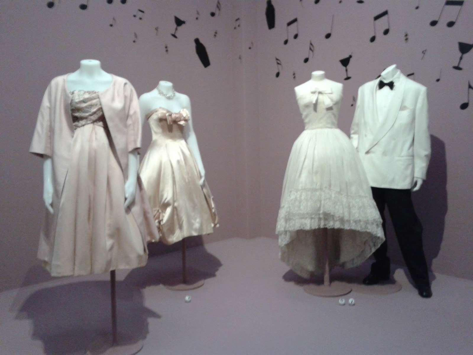
This is the display which awaits the visitor in the first room of the exhibit: genuine pieces from a very recent (I believe it was winter '09/'10) Chanel show, on loan from Chanel and set in these stunning, very appropriate surroundings. In this shot, 'my' class is milling around the pieces, but otherwise it wasn't that busy (several school classes on guided tours, but no more crazy crowds, at least not at 10 a.m.). These exquisite pieces of present-day couture were (almost) close enough to touch, so I could finally figure out just how that dainty square shoulder is achieved (maybe more on that later ;)
In the rest of the exhibit, the sense of decorum in creating surroundings for the pieces continues. There are loads of fabulous clothes, from Worth dresses to those last year's Chanels, and originating mostly from Paris but also from the Netherlands and China. I loved it, but it made me quite hungry to see more of the alledged 4000 pieces in possession of the museum. Please tell me: where do I go, what do I do, to become a fashion curator??


On other news: I kind of promised I would try to answer some of your questions as put to me in the comments. I'm always very happy with all your imput, but sometimes, people will ask me specific questions which require a seperate reaction. I will try, starting at the most recent one.

- lorrwill asked me, in the handbag refashion post, if I have any tips on sewing leather. I do, but none of those were used on that bag. I have made leather bags before, but for the one in that post, I just glued a piece of leather to a worn-out vintage bag.
If you want to make a leather bag you will definately need special needles. There is a special type of needle for leather (with a cutting tip) and it comes in sizes from 80 up to 110 (as far as I know). The size you need will depend on the kind of leather you use. In a lot of cases, especially with thinner 'clothing weight' leather, you can use ordinary thread, but if you were waiting for a project on which to use that 'extra strong' thread (as sold by Gutermann), sewing leather is it. Machine feet can be an issue as well. Leather tends to stick to your machine on both sides and because of that, I was taught to sew it sandwiched between two layers of tissue paper. Since then, I found out that there are big differences between sewing machines in how well they deal with this issue. I have never had the opportunity to try out sewing leather with a walking foot, but I have heard/read good things about it. My advice would be: try on a scrap first and always sew slowly.
One last note from me: just sewing bits of leather will not give you a handbag as structured as the one in my post. All bag manufacturers (even the very posh ones) use inner structures of things like cardboard and plastic to create shapes like that. Using only leather, you can make fabulous soft and even fairly structured bags, depending on the thickness of your material (and what you can use, will depend on what your sewing machine can handle)

- Ana, I'm sorry to hear my jeans skirt pattern on Burdastyle has now developed downloading problems. It was working on the old site, but this is the first time I get any information on how it behaves on the new one. I will check, but I know they should have the correct file over at BS.

- All of you who asked for how-tos on the lingerie: the problem is: finishing is the hardest part. Sewing on that elastic. And you can really only learn that by trying, preferably with some real-life help and advice. For advice on it, and for great pattern tutorials, take a look at patternschool (I haven't used their patterns myself, but they seem both understandable and good). For the rest, I'll keep your comments in mind for my next lingerie project.

- Miaaa asked (in a comment to the gored skirt tutorial) about the pattern for my bias cut skirt of December '08 (as featured on Burdastyle, and on an outfit-post on this blog last winter). That skirt was made using an adeption of my personal skirt sloper, however Burdastyle has the Sidonie skirt which is also a sleek bias cut skirt. I know that skirt is kneelength and uses a facing instead of a waistband, but you could lengthen it and make a simple straight waistband (that's what mine is)

- hing12133 asked if she could link to the gored skirt tutorial, and did so in this lovely blog post

Ok, that's it for now. If you need an answer to any question put forward in an older comment, please let me know about it again. I promise I will try to answer.
Recent creations are coming up tomorrow!

March 4, 2010

Museum tip


If you love fashion (and let's face it, which girl doesn't?) and you find yourself anywhere near The Hague (Den Haag) in the Netherlands in the coming months, don't miss the 'Voici Paris' exhibit at the Gemeentemuseum Den Haag.
It will cover the history of haute couture from the second half of the nineteenth century till today, so there just have to be some marvellous creations on display. Just follow the link to find out what the good people of the museum have to say about it (in English).
By the way, the dress in the picture is by Givenchy and was worn by Audrey Hepburn in Breakfast at Tiffany's.

I haven't been to see it yet (I heard reports about waiting endlessly) but, with The Hague being my home town, I definately will in a month or so. And I'll let you know what I thought of it.

November 28, 2009

Playing catch-up (and weekly outfit nr.9)


I'm afraid I got a bit behind on posting this week. In part, the weather is to blame for this. For most of the week, it's been raining so much that there was hardly any proper daylight. Not good for taking pictures...

I'll try to make up for it now. First of all, a new 'weekly outfit'.

I made the top last week, and wore it for the first time this week. It is made from woolmix knit and was my attempt to make kimono/batwing sleeves work on me. Roomier ones require a different kind of figure, with breasts... This particular shape probably wouldn't work in a woven fabric (too confining) but it's fine in a knit. For added interest, and to have an excuse for a center back seam (and thereby saving fabric) I made a fairly deep V at the back. The trousers are one of the first things I made using my new sewing machine, somewhere back in June. I still really like the fit-and-flare shape, the topstitching details and the pockets with flaps.

It occured to me that this top is hardly the only recent creation I haven't shown yet. So, I'll show the rest as well.


I made this dress last weekend. Unfortunately, the picture isn't very clear, but it has a smocking detail at the front under the bust. I kind of like it, but it's a style I have to get used to. I've been wearing it with a little bolero jacket in black jeans. Both for warmth, and to give it a bit of an edge.


For this blouse, I used the first pattern for a top I ever made. I only changed the collar. I'm not that happy with it. I love the original blouse (which is black and has a larger and floppier collar) and have worn it a lot. When I bought this gray cotton for one of E's shirts, I was convinced that it would be a good colour for me too, and so I bought extra fabric. Yet, I'm stuck with a blouse which somehow doesn't look or feel quite right to me... I think it's mostly a colour-thing and I wouldn't be surprised if washing it helps with the rest(that will take the starch out of the fabric). Lately, even my crazier plans usually work out, so I'm a bit surprised at the being disappointed by what seemed to be a very safe project...
Well, better next time.


These trousers, I finished just this morning. I realised a while ago that I didn't really have any good trousers anymore, excluding the jeans. The pair in black stretch twill I've had for two years are pretty faded by now, so no longer good for more formal occasions. I used the pattern I made for that much loved pair and made a new one using thin charcoal grey woolblend. Flared legs, scoop pockets at the front, single welt pockets at the back.
I bought 4 m of this fabric, so you're going to see more of it. I'm slightly addicted to making jackets (although I try to keep that in check, I don't wear jackets that much...) so there will probably be one of those. And I'm sorely tempted to try and make a pair of belt pleated trousers. Which could be either great, or a total disaster. I'll keep you informed.

Lastly, I've got a museum/city tip to share. Last Thursday, M and I went to the Antwerp Fashion Museum, MoMu. We saw the exhibition about Belgian leather brand Delveaux (handbags from the 1930's till 2000, plus history, patterns and an impression of the atelier), work by incredebly talented first year BA students of the Antwerp Fashion School (I strongly suspect these people graduated from some other art school before starting there, that would explain the level of their work) and at Modenatie (a separate store/galery bit) items from the Yohi Yamamoto winter collection. And, despite the appalling weather, we did some great window shopping along the Nationalestraat (where the museum is located). Now, this exhibit is too small to be worth a long trip, but if you happen to be near Antwerp, or have some way of getting there easily and cheaply, it is definately worth a place on your to-do-list.